Packaging inspiration

7 February 2011

I have been looking at different styles of packaging that relate to the idea i have come up with for my packaging. Which is to make it out of material similar to that used for ship sails. I have found a variety of different packaging i like, well certain elements within it.

This CD cover is a really nice touch. Its this sort of attention to detail i like.. 
I am not 100% sure whether it would be appropriate to add that sort of detail to my design, 
but its an idea that i can look at once my packaging it done. 

What i like about the above packaging is the text, and also the idea of having a slip
in within my packaging that could possibly contain the information about the DVD
and what's on it. 

With this packaging I am interested in the thick material and how
it looks. This ends up looking like a bound book, and i like the use
of the thick black rope.

This is a much more sophisticated style of using material/fabric
to package a product. I really like the line illustrations on it and
how it is bound like a book. You can see from the images that it 
would be very soft to touch. I don't think this sophisticated idea is what
i want to achieve with mine.

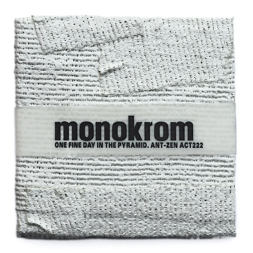
Again with this it is more of the texture i am interested in.
The concept isn't applicable to my idea, but i do like the band around it that
has the information about the product on it. 

This is probably the most similar idea to what i've had. I want to be using
that sort of thick material and have it bound with string.
I really like the style and it the simplicity of the idea. 

Ship Sails

I have come up with an idea for my packaging that is based around the rigging of a ship. I knew at the beginning of my project that i did want to incorporate the rigging somehow, and i though by looking at the sails from the huge old ships i could use that texture in my designs. But i decided to scrap that at an early stage. So now i am revisiting the idea but instead of using it in my animation i want to package my CD in it. The idea being that the CD would be packaged in a ripped off piece of sail. This is a appropriate to my design because it relates to the concept and brings a part of the pirate life alive. What i also really like about this idea is the fact that its textured and it gives something for someone to interact with.


I have been researching the materials of the cloth used for sails, its a lightweight but durable material and was nearly always white. It was hard to dye things that were so huge and so costly. The sails weathered well and could be repaired quite easily. The above images have given me a basis to find material that mimicks the style of the ship sails. 

Bottles

5 February 2011

For one of my idents the idea is to have a 'message in a bottle' floating across the screen. For that i needed some inspiration on what i needed the bottles to look like. Luckily my dad is quite an aid old wine bottle collector so i had some idea of what old bottles looked like. Generally they are crooked and not symmetrical all the way around.


These bottles are thick and fat, which is exactly what i am looking for. Their style is similar to that that i imagined for an old fashioned bottle.