BLACK PACKAGING.

8 November 2010

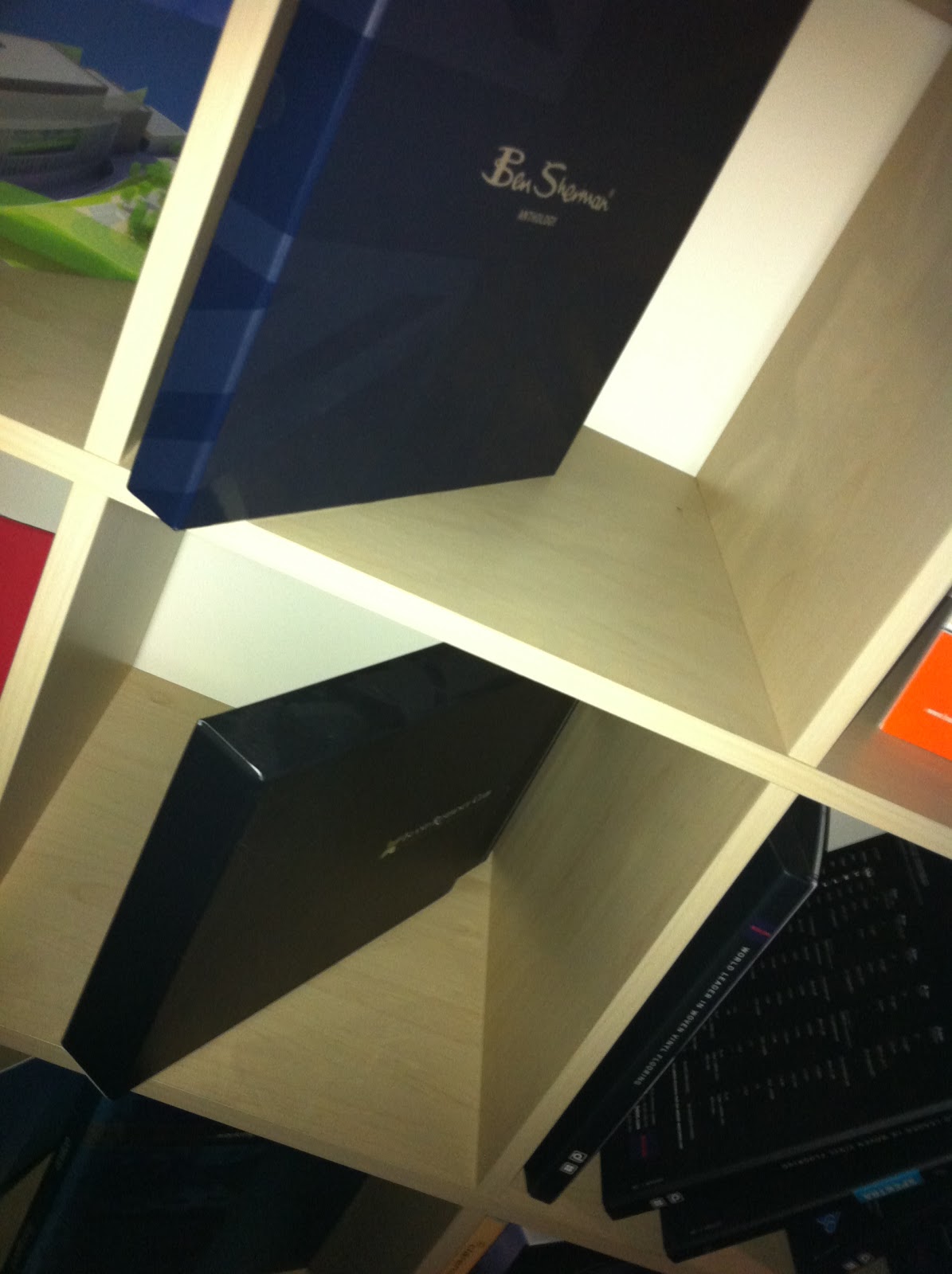
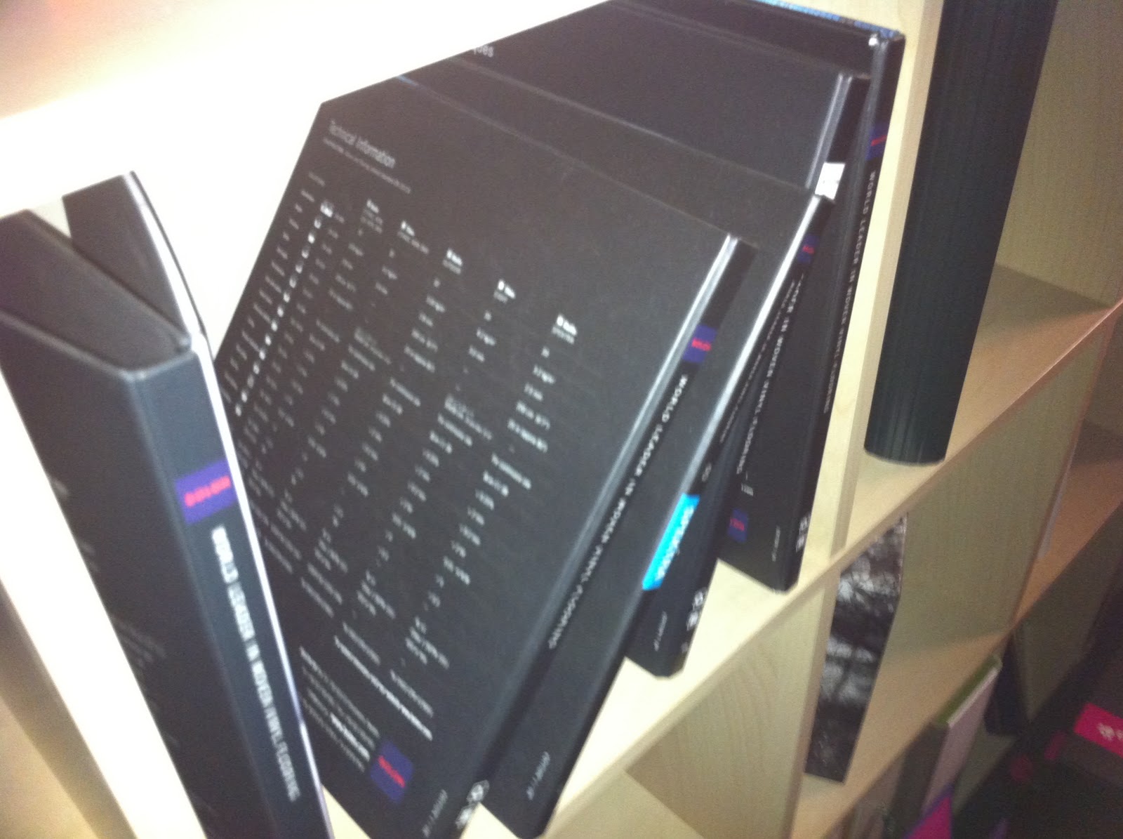
As i have decided to do my packaging in black i have decided to look into a variety of black packaging that incorporates the styles i am interested in. For example spot varnishing, embedding etc.


Billboards - Hyde Park

Here are images of the billboards that are on Hyde Park corner. these are the main billboards around Hyde park and headingley area, they are great because you see them as you are going into and out of town which is great because it means you will see them when you go and when you come back and they always draw your attention. 

My main focus is to look at using images 2 and 3, they are the larger billboards and would fit well within my specification for printing the billboards. my billboards designs are long and narrow and they would fit well within these boards. Also because they span over the same area it means you can have two similar boards there telling different facts. 

Billboards 1 and 4 are way too small and dont have nearly enough room to fit my designs on i think they would look too squashed. i like the 4 split boards but it doesn't work with my design so i wouldn't use them. 

I am happy with my choice in boards it gives me a variety and actually helps put my boards into context.
1.


2.

3.

4.

UV PAINT

30 October 2010

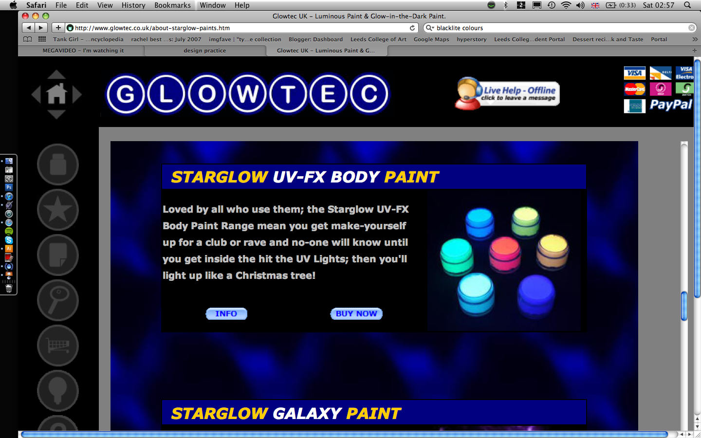
I have been looking into UV paint, to use when producing my mock up ands to just try working with the substance to see how easy it is to use and how i can manipulate it. I have ordered the paints, but they won't arrive for a while so at the moment all i have is examples of the pots to look like.

BLUE

WHITE


BLACKLITE PRINTING

27 October 2010

Here i have found a website that will print your posters in blacklite, this culd be useful for me when doing a mockup:
Build A Poster - this is the website that i found, and the information that is most useful to me.  I wanted to look as costing because it is important to see how much it would cost if i were to do this as a mock up.


  • How do I get my files or images to you guys?
    There are a number of ways to place an order and to get your image to us. The simplest and most time efficient method is to just place an order through this website. If you would rather not use the internet, you can always email us at help@BuildaPoster.com. If you need assistance placing your order, you can reach us by phone, toll-free at (866) 475-1306.

  • Can I FTP a large file to BuildaPoster.com?
    Yes you can! We can provide an FTP server for you to upload large image files to. To find out more information, email us at help@BuildaPoster.com with your request, and we will fill you in with the details

  • What exactly does this company do?
    We provide a printing service for the public at a very low cost, but at a very high quality. Virtually any size can be printed up to 24" x 90" and anything smaller. Our process uses a florescent dye-based ink system, which provides brighter color than any other printing service available. We believe people should have complete freedom when decorating their lifestyles so we created a service to provide that freedom. You can build a poster or banner from anything you create, supply, or find on our website. We offer original artwork created by some of the world's finest graphic artists, painters, photographers, and more!


  • How much does it cost?
    Pricing on all printing is based on the dimensions of the print, and the type of paper chosen. Click here for a listing of our standard retail prices without any discounts or promotions. To view our current discounts and promotions please click here.

  • What is so special about your printing?
    We print using a specially formulated blacklight-sensitive ink system that you cannot find anywhere else in the world. Our printing glows brightly under the presence of a blacklite, and appears normal but much more vibrant than standard inks when presented under normal lighting. Rather than having limited "bright" colors to choose from, we have a full range of beautiful blacklight-sensitive colors to print with. Even the most detailed photographs come out more vibrant with our printing.

  • What sizes can you provide?
    We can provide any size necessary. Any requests larger than 24" x 90" must be made by special order. Anything up to 24" x 90" or smaller, can usually be printed upon the same day you order it, and shipped to your doorstep immediately. To request a custom size, that is not offered through our website, please email us athelp@BuildaPoster.com with your complete request, name, phone number, and other pertinent contact information. We love to work with you to create the perfect custom print job.

  • Does your printing fade?
    Unfortunately, all printing fades. Flourescent colors have a unique reaction to sunlight or long periods of exposure to bright lighting. They tend to fade fairly quickly and noticeably. It is recommended to frame, laminate, or protect your prints and more importantly, DO NOT DISPLAY THEM IN SUNLIGHT OR OUTSIDE! When kept indoors and/or out of direct bright light for long periods of time, the posters last beautifully for over 3 years.


  • Pricing list for printing. as you can see they are quite expensive. the problem isnt just the printing its getting them shipped over to the UK which will cost a lot as well. So it is something to consider, but i am going to look for other alternatives and see f i can do it myself.

    UV PRINTING PROCESS

    UV Printing

    UV printing is a high quality, exceptionally durable and cost effective large format printing process for the production of a wide range of display graphics. There are two types of UV printing offered, firstly roll fed UV printing where graphics are printed onto a roll of media, often films, vinyls and PVCs, and flatbed printing with UV inks, where graphics are printed directly to various, rigid or flexible, flat surfaced medias and substrates, often PVC Foamex boards or ACM (aluminium composite material).

    UV printers use environmentally friendly UV curing inks, which are cured with UV light which also means the inks have to be very UV resistant, therefore, UV prints are extremely good for graphics that are situated in direct sunlight. UV prints are also water resistant and abrasion resistant so are perfect for outdoor graphics in all weather conditions

    Inkjet Printing

    inkjet printingInkjet printing is one of the most brilliant of the digital large format printing options available and probably offers the greatest photo-realistic graphics of all digital prints. Inkjet printing has brilliant colour intensity, especially in the red range, making it the ultimate choice for high impact display graphics. Inkjet printers use CMYK inks and can print onto a range of various medias including: photo papers for posters, backlit film for light boxes, stop light film for banner stands and pop up stands, as well as various other vinyls, films, banners, canvas, fabrics and textiles; making it an extremely versatile form of printing. Depending upon the material used and the finishing inkjet prints are suitable for both indoor use and outdoor use.


    Digital Printing

    Digital printing, by definition, is the reproduction of digital artwork onto the surface of printable media. Therefore, digital printing encompasses a vast range of printing methods including: inkjet printingUV Printing and photographic Lambda printing; although it is most often referred to in relation to the full colour, toner based printing used for short runs of small format prints. W&Co’s digital printing, however, is mainly focussed on large format printing for posters, display graphics, promotional display prints, self-adhesive graphics,  light box printingbanner printingPOS printing etc.

    Black-light example

    26 October 2010


    this is an example of what i would be trying to achieve in printing my billboard for the black-light technique. Not only do i like this design but it works so much better in the black-light because of the whole connotations towards skulls being black and scary etc. Its really interesting how they have done this, i am not sure whether it was printed or not, i think the skull has been and then the background drawn on or painted on. Either way its really interesting, and highlights exactly what i want to be doing.

    The next stage is to now start looking into printing in UV paint and how it can be done on a mass produced size.

    BRAIN WAVE!

    early in my research i had been talking about using billboards to show my information and talking about incorporating light into it somehow. Since then i have been looking at ways type has hidden things, and how i want to try and work on that aspect. While looking through a blog i found this image. And then i came up with the idea of using the billboards and having the image printed in ultraviolet paint, so that when a black-light was shone on the image it would light up and show my design. this works on very different levels which is what i wanted:
    1. The girls are hidden from the world, and so is the crime
    2. I want to shed light on the matter
    3. Its a dark business and by using the black-light it will be most effective at night
    (having said that i could print on a black substrate so it stand out in the day as well)

    This is exactly the sort of idea I was looking for. 


    I really like the layering on this image.
    I think its clever, because its illustrated well
    just using type. this style could tie in nicely
    with my project by having stuff hidden behind type.
    again working along the lines of the women
    being trapped and hidden away from
    everyone else. And then using my role
    to bring it all to light. By creating depth like this it makes your
    eye strain to see what is being said, which means that when
    people read it they have to look hard and will therefore
    remember what had been said or described.
    Its an interesting way of showing information.


    What i like about this image is the link between type and image. 
    Its a powerful image to use and breaking it down to 3 colours
    makes the bits you want to stand out. The play on words
    works really well in illustrating the image, and vice versa. 
    The bold title really grabs your attention and makes you want to 
    read the article further. If i decided to use both type 
    and image i defiantly want to try and make it as powerful as this. 
    As always simplicity with this is the key, if you bombard people
    with information they will just walk away. 

    Type and Image

    25 October 2010


    This is using image and type to create a powerful design.
    The concept itself is very simple, and taking the sentence
    literally really works for it. Using helvetica keeps the type
    clean so that when it does shatter it doesn't loose its readability.
    The reason i am looking at it, is because of the connotations 
    towards my own project. the destructive nature and the symbolism
    of something being shattered and using type to emphasis that
    point. The girls lives are shattered when they become
    trafficked and using this symbolism would work well. I am
    not yet sure how i could use this but its something i
    am interested in. 

    Typography

    I really love this stye of typography.
    Using type to create a complicated design. 
    Its amazing how much detail you can 
    actually get within a face from using type,
    and the different sizes styles etc.
    The reason i am looking into creating faces
    out of type, is again looking at creating
    a range of women's faces that have all the
    information of the sex trafficking
    trade within them. I think the images
    created using type can really be
    emotive and it gets to people
    on a different level. I can also be
    quite creative with the images i decided to 
    create and what to use. This could also
    link into the range i am thinking of creating
    with the billboard designs etc.
    I love researching like this because it
    really opens my eyes to the possibilities
    that are there for me.

    Typography


    Seeing as my project is going to be based heavily on information and type i really want to get my type right. I want to make it look right and not just some boring information pamphlet. I want it to grab peoples attention. So i have been looking into typography that is similar to what i want to do. I have been looking at a variety of different styles and i am hoping to draw from each in order to get the best out of them for my project.

    There are so many different styles of typography and the way it can be used. From just using the words and then using the words to symbolise something or create an illustration. Personally i think the simpler the better, but sometimes throwing everything at it works, if its in the right context.

    For example, the above image works well, the layered type and different lengths in sentences makes the face shape look like its traveling fast. We have been doing loads of type workshops with Graham which has really opened my eyes to what i can do with type to make it more effective.
    I really want to get my type right, so i want to spend some time researching what i like.

    Guerilla advertising


    Again this is a very simple idea, but it works well. People walk on the streets everyday and people either look up or down and by drawing something where they are going to see it will capture their attention. Its interesting because it is so simple. I could use the same technique by just writing facts in chalk everywhere, it will eventually wash away and it is extremely inexpensive. 

    Guerilla advertising


    Again this is looking at location of the advert
    more so then the image itself. The images are
    advertising going to the gy uation m. They have used the sit-
    well, by utalising the surroundings it really
    emphasises the images and what they are 
    promoting. Its cleverly done, putting huge images up
    in the center of the street will immediately draw peoples
    attention so when they are just walking past they will take it
    in. Not only that they will almost certainly go and tell their
    friends what they saw. This doesn't only work on
    people just looking at the images it works on word
    of mouth as well, because if one of those friends is thinking
    of joining the gym then they will go and investigate this advert. 
    Its interesting and very clever.

    Guerilla advertising

    This is a really simple advertising technique, but it works well because of its location. The tube sees thousands and thousands of people every day and by using the wrist strap that everyone puts there hands in to advertise your product is clever. People like to read whilst traveling on the tube so not only does it give them something to look at it, it will make people take it in. With some simple editing on my behalf, changing the watch strap into chains and putting some basic information about the sex trafficking trade onto the image would have the same affect, except it will inform people not just make them want to buy something. its a very simple but effective design and it works well. The location is the key to this product working, but they got it right. 


    I really love this campaign. It is so powerful. The fact that it isnt drawn on as well and actual works as a 3D working image, makes people really look at it and pay attention, which is the main thing for this campaign. It ties into my project well because the idea of shocking people to try and change their actions, is exactly what i am trying to do. Its interesting how the project works on so many levels, because using a child make you feel responsible and obviously getting it to work in the rain is fundamental to what they are trying to prove. I want my concept to work on a variety of different levels like this.

    Guerilla advertising

    22 October 2010


    I really like the simplicity of this design. And using object you would
    associate with crime, especially theft and abuse. The reason i am looking
    at this is because of the idea of the range of products from billboards, 
    to posters in trolleys to posters on trees and the materials used to stick the objects up.
    Duck tape is used heavily in association with keeping people
    quiet and kidnapping, which links with my sex trafficking idea and raising the awareness.
    I want to use as much symbolism with my project as possible to make the links easy and 
    affective. 

    Guerilla advertising


    This is an interesting way of using an image and objects that are already out there. This campaign works really well because its constantly with you while you are doing your shopping. It will stop and make you think which is interesting. With regards to my project this is a great idea for illustrating the women are trapped and you can help them by using the basket as the cage. This could easily become a range of images, for example the billboard designs transferring into shopping baskets etc, it could become a very viral campaign. 

    BillBoards


    I really like the idea of this billboard design
    it uses the natural surroundings to emphasise
    the design and what the product is about. The
    product being natural and the billboard using
    natural lighting to show it. The clever thing is
    it works with all the lighting, and whats even cleverer
    is the fact that its a natural hair dye and with
    the different lighting it shows different hair colours.
    You can tell a lot of thought has been put into the 
    design and it really pays off. Again i think when
    i design for the billboard i want to try and incorporate
    the natural surroundings to enhance
    what i am saying. Of course it will be different from this
    but has given me something to think about, and a chance
    to look at something when it really works.