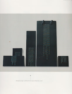
Really like the simplicity of this and the use of the serif font.
What i think i like about this the most is the layout. How the
layout falls around the side of the packaging in a really interesting way.
I really like how the type is spread along the side
of the packaging, its broken up but still legible.
Really love the use of the type here, its looks like
its raining down the side of the packaging. Its just an
interesting way to use type and layout.
Really love this fold over box and how the type
is used across the whole of the net. I also
like how its wrapped around the packaging, this is something
I am defiantly interested in trying out
Really like the thin stoked type here,
the light type contrasts really well against the
background. It also creates its own pattern.


0 comments:
Post a Comment